
How a forced technical rebuild became an opportunity to rethink the entire customer journey.
Overview
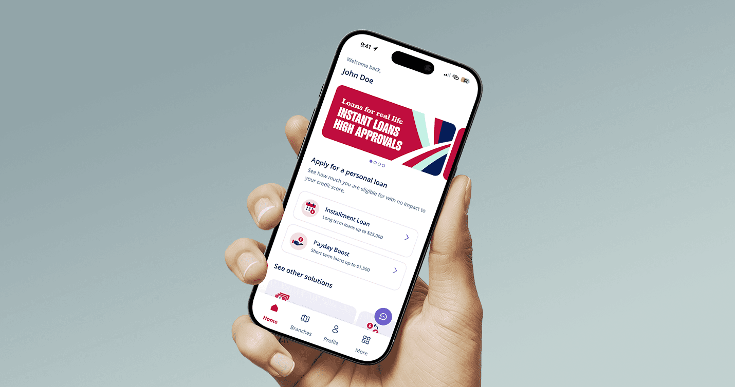
Money Mart's mobile app had a problem that couldn't be ignored much longer. The app was built on aging technology that was being phased out — creating security risks, support headaches, and the very real possibility of falling out of compliance with app store requirements. A rebuild wasn't optional. It was going to happen.
The question was whether to simply move the old experience onto newer technology, or use the moment to build something better.
The team chose to build something better.
The old app had friction built into every step. Customers had to fill out a long application before finding out whether they even qualified for a loan. And at the end of that application, the system ran a hard credit check — the kind that leaves a mark on your credit score. For customers who were already uncertain about whether they'd be approved, that was enough reason to walk away.
A competitive review of other Canadian lenders made the problem even clearer. Apps like iCash and Easy Financial asked for less information upfront and showed customers their likely eligibility much earlier. Money Mart's flow was the longest of any competitor reviewed. The gap wasn't small.
I was part of the team that redesigned this experience — working across the customer-facing mobile app to reduce friction, reduce credit risk for customers, and build a foundation flexible enough to support new products as the business grew.
What We Overcame & Achieved
Customers were abandoning the process before it even started — because of what came at the end.
The biggest barrier wasn't a confusing screen or a slow load time. It was the hard credit check. Customers knew it was coming, and many didn't want to go through a full application only to find out they didn't qualify and take a credit hit in the process. The result was hesitation, drop-off, and lost applications that might have converted with a lower-stakes starting point.
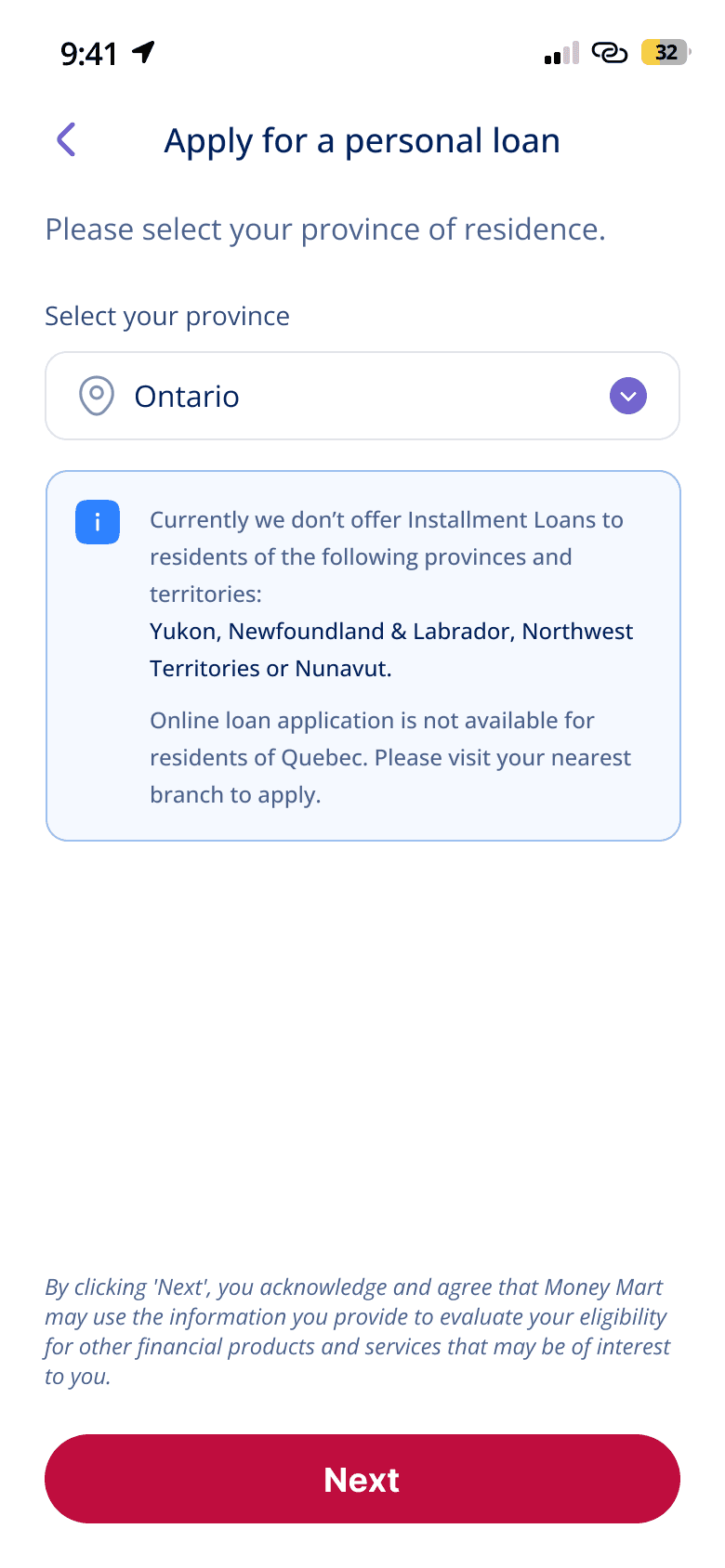
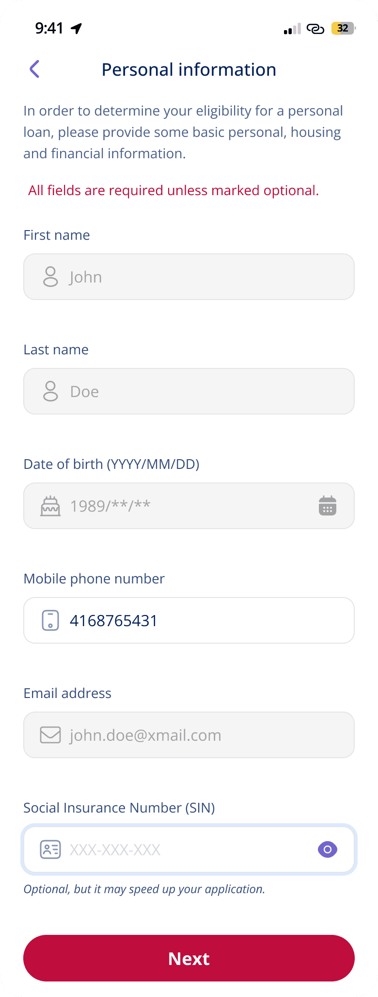
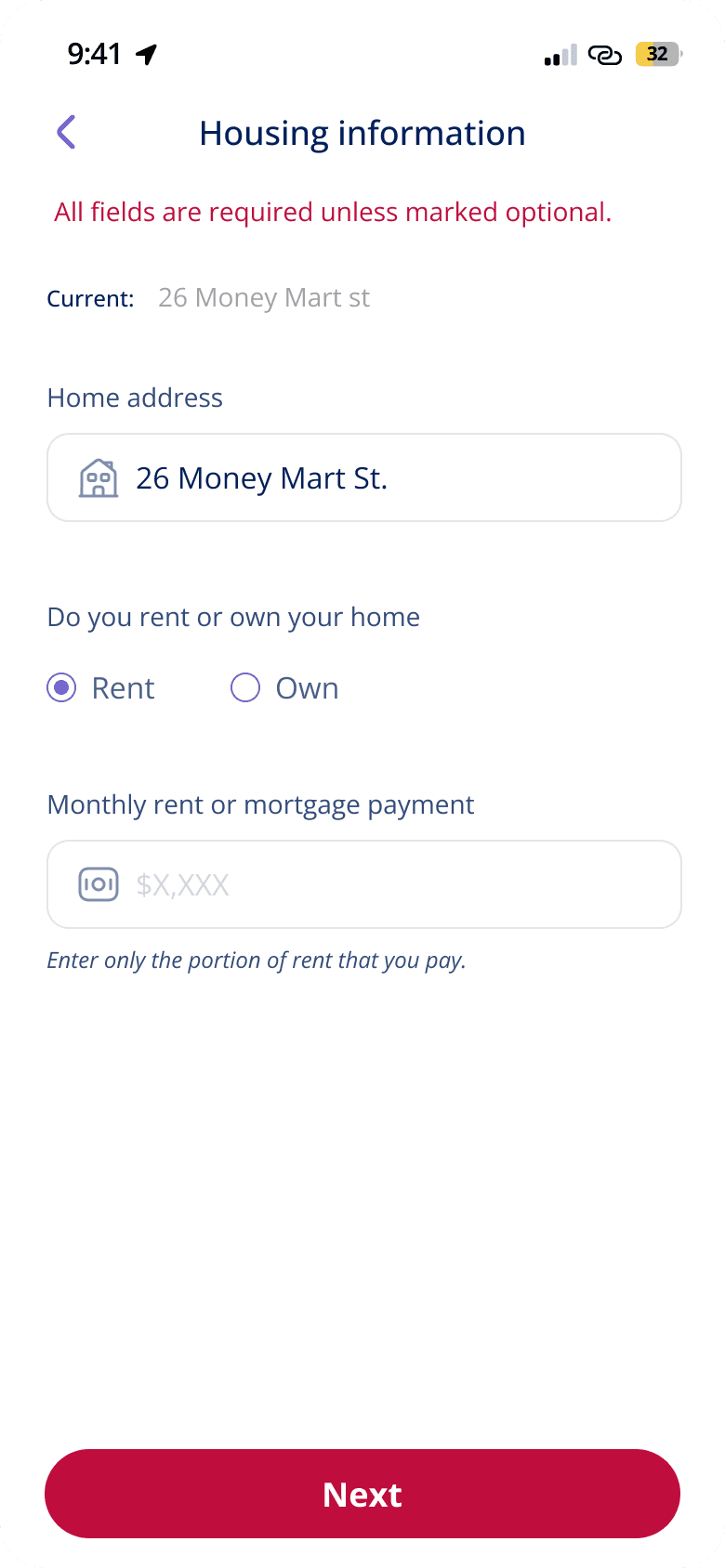
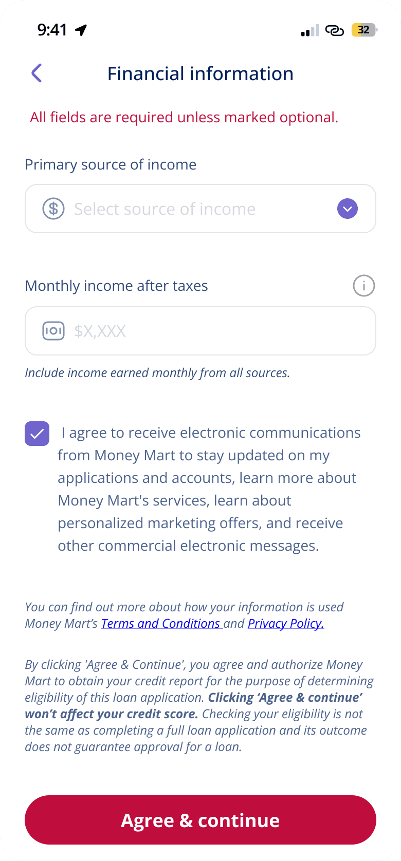
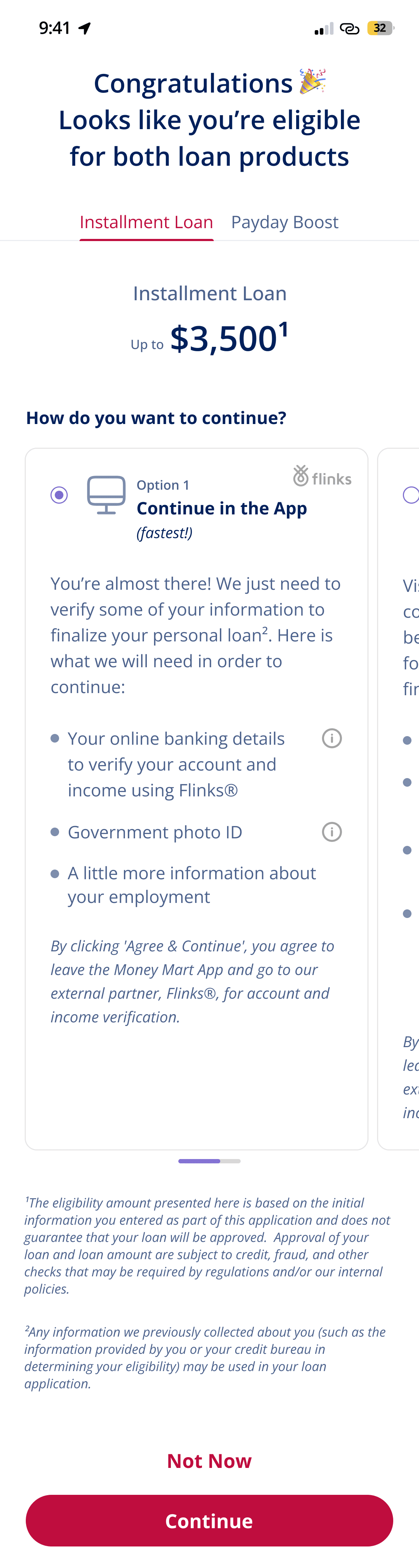
We introduced Quick Apply to solve this. Rather than pushing customers straight into a full application, Quick Apply collected basic personal and income information upfront — name, address, housing details, income source and amount — and used that to give customers an early view of which products they were likely to qualify for, before any credit check ran. It wasn't a guarantee, but it gave people something they didn't have before: a reason to keep going.
Steps →

We fixed the hardest step in the full application — proving your income.
Before the redesign, customers had to upload proof of income manually — scanned documents, PDFs, sometimes photographs of pay stubs. It was slow and stressful, especially for people who didn't have those documents readily available. Many dropped off at exactly this step.
We integrated Flinks as an alternative — a service that lets customers securely connect their online banking instead of uploading documents. Flinks reads recurring income patterns from transaction history and pulls the relevant data automatically. The Flinks screens themselves were provided by Flinks as an embedded, bank-verified experience — a deliberate choice to use a trusted third-party interface at a sensitive moment rather than building a custom flow.
The result spoke for itself:
40% reduction in application time.
Drop-off at the proof-of-income step fell significantly.
After approval, customers needed flexibility — not a single forced path.
Once a customer was approved, the old experience pushed them toward one decision immediately. The redesigned app introduced an approved products page that showed approved amounts for each product separately. Customers could start the process for one product, return to the page, and then decide whether to move forward with another. There was also the option to switch from the digital flow to completing the process in person with a staff member — useful for customers who wanted human support at the final step.
The Why and How
The rebuild created a rare window — and the team used it intentionally.
Most redesigns happen under pressure, with limited scope to rethink fundamentals. This one was different. Because the technical rebuild was unavoidable, there was an argument to be made for doing more than a like-for-like replacement. The team — working across product, design, and compliance — made that argument, and it shaped everything that followed.
Reducing perceived risk mattered more than reducing the number of steps.
Old flow:
Register
→
Full Application
→
Hard Credit Check
→
Result
New flow:
Register
→
Quick Apply
→
Eligibility Results
→
Full Application
→
Hard Credit Check
→
Result
The competitive review showed that faster-feeling apps weren't necessarily shorter — they just delayed the heavy requirements until later. Customers are more willing to continue a process when the stakes feel manageable at the start. Quick Apply applied that principle directly. By moving the hard credit check later and giving customers early signal about their options, the experience shifted from "prove yourself first" to "understand your options first."
Compliance and design had to work together, not against each other.
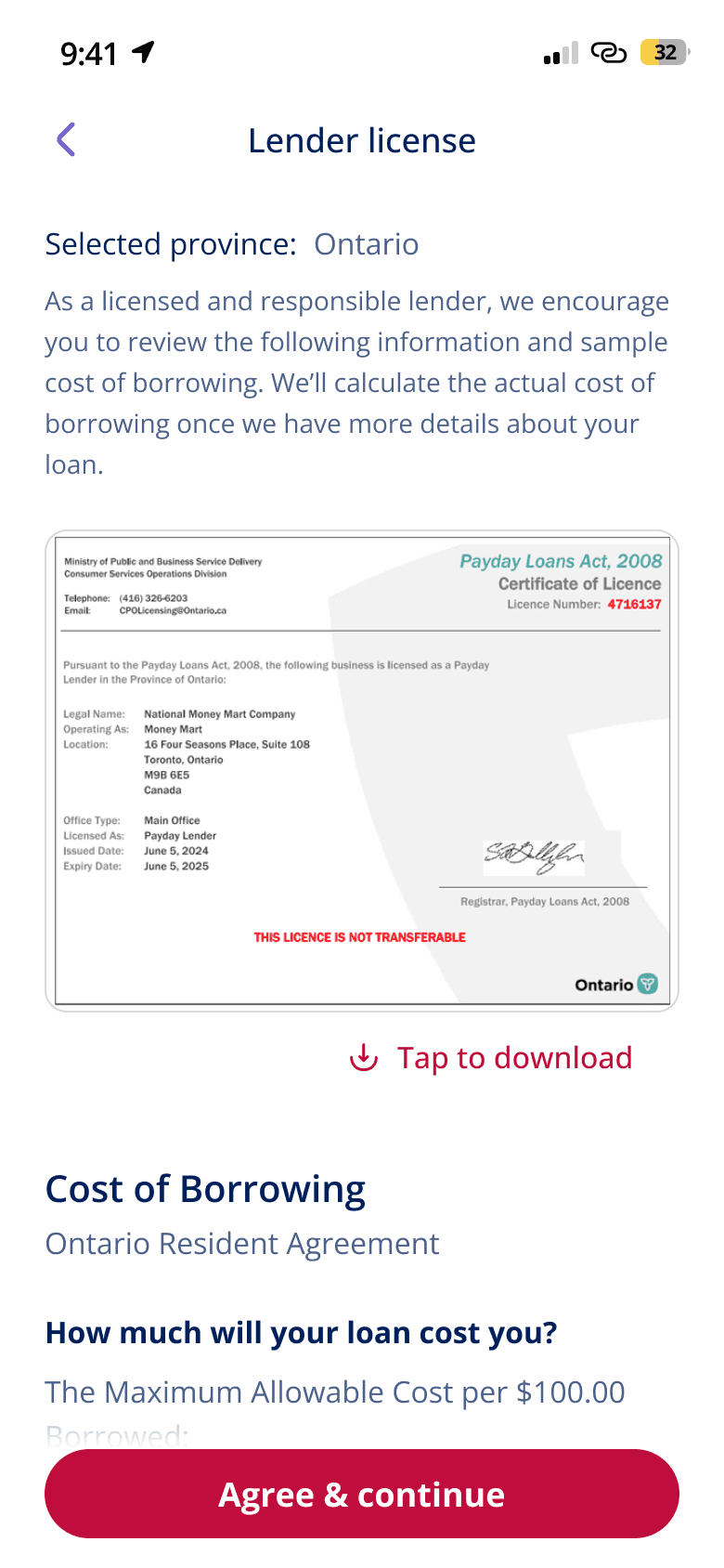
Quick Apply wasn't just a UX idea — it required close collaboration with the compliance team to determine what information could be collected at the pre-qualification stage and what had to wait. The same was true for the e-signature documents that appeared in the full application flow. When a customer selected products that required a hard credit check, the app presented the relevant documents upfront so the check only needed to run once. Getting that logic right required design, product, and compliance to stay closely aligned throughout.
Flinks is the clearest example of how operational and UX improvements can be the same thing.
Manually reviewing uploaded income documents was slow for customers and labour-intensive for internal teams. Flinks improved both at the same time. Customers got a faster, lower-friction step. Internal teams got structured data instead of scanned images to review. The 40% reduction in application time wasn't just a user experience win — it was an operational one too.
Before:
Upload a scanned document or PDF
After:
Connect your bank in seconds
Result:
40% faster applications
The design had to be flexible enough to absorb change.
Building the app on a clear, well-structured foundation meant that as business priorities shifted and new requirements came in, the experience could adapt without breaking. That flexibility wasn't accidental — it was a deliberate part of how the redesign was approached from the start.
The result was a mobile app that did what the business needed technically, and what customers needed experientially — a lower-pressure way to understand their options, a faster path through the hardest steps, and enough flexibility to meet people where they were.
Designing high-trust products that balance compliance, clarity and conversion.
Schedule a call with Abhijeet