

Transforming a Legacy Investment App into a Trust-First Growth Platform
COMPANY
Kotak Mahindra Bank
YEAR
2023
Overview
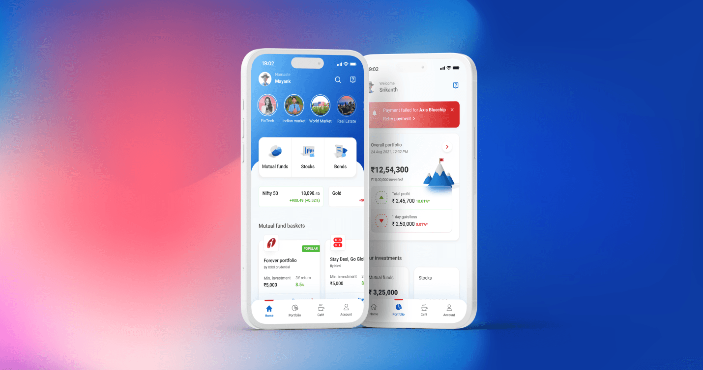
Kotak Cherry is a comprehensive investment platform by Kotak Mahindra Bank. While the brand carries immense credibility, the legacy application struggled to compete with modern, digital-first competitors like Groww and INDmoney. The project aimed to rebrand and redesign the experience to better serve the next generation of Indian investors.
As the Product Designer, I focused on high-impact journeys, specifically SIP (Systematic Investment Plan) onboarding and the Autopay mandate flow. The primary business goal was not just a visual refresh; it was a strategic initiative to drive recurring AUM (Assets Under Management) growth by reducing friction and building long-term investor confidence.
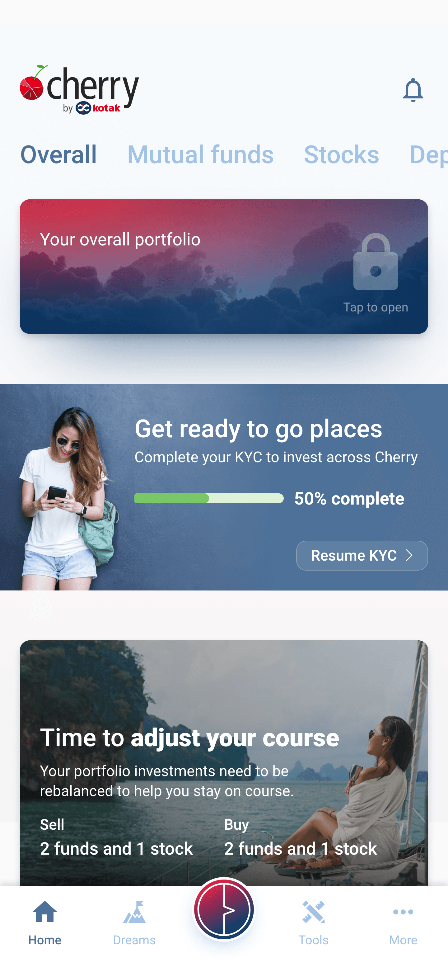
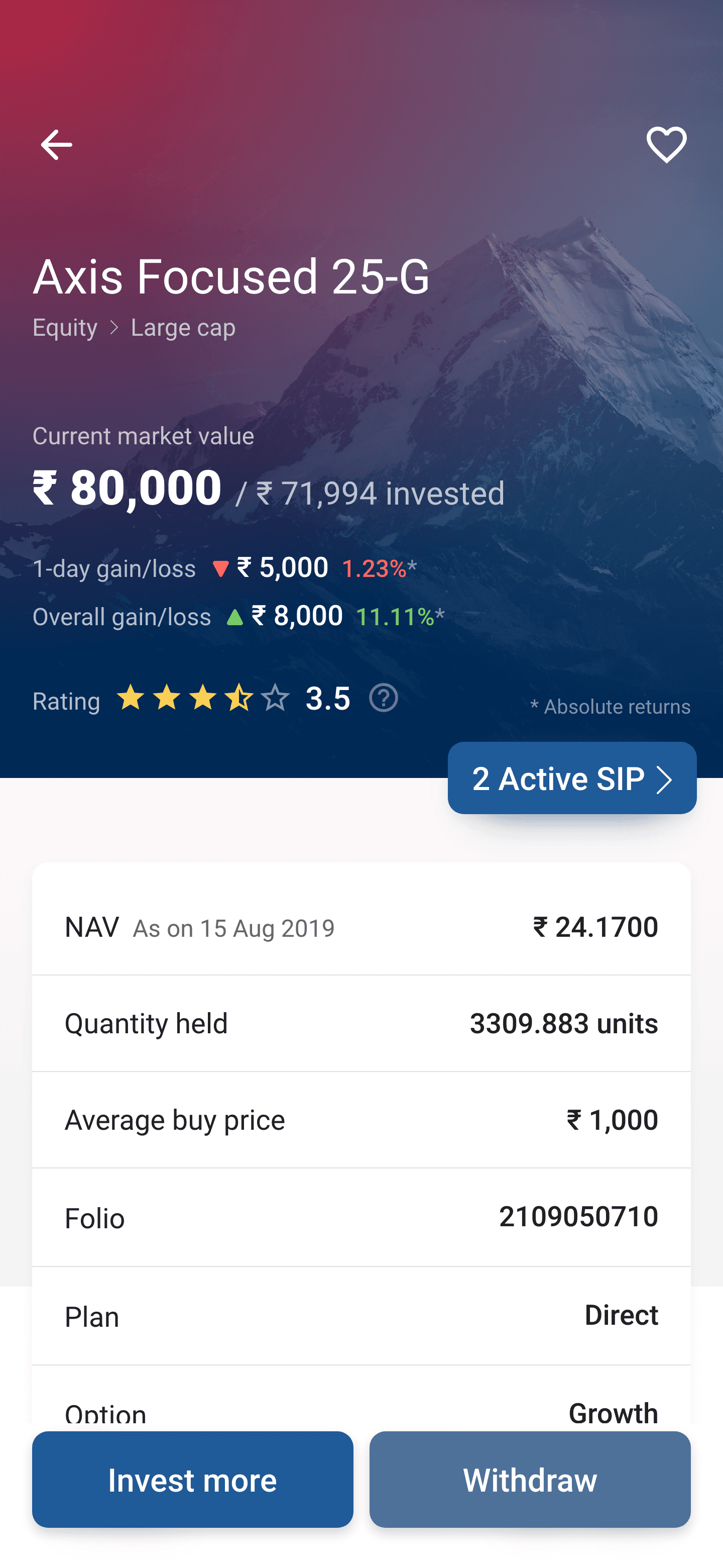
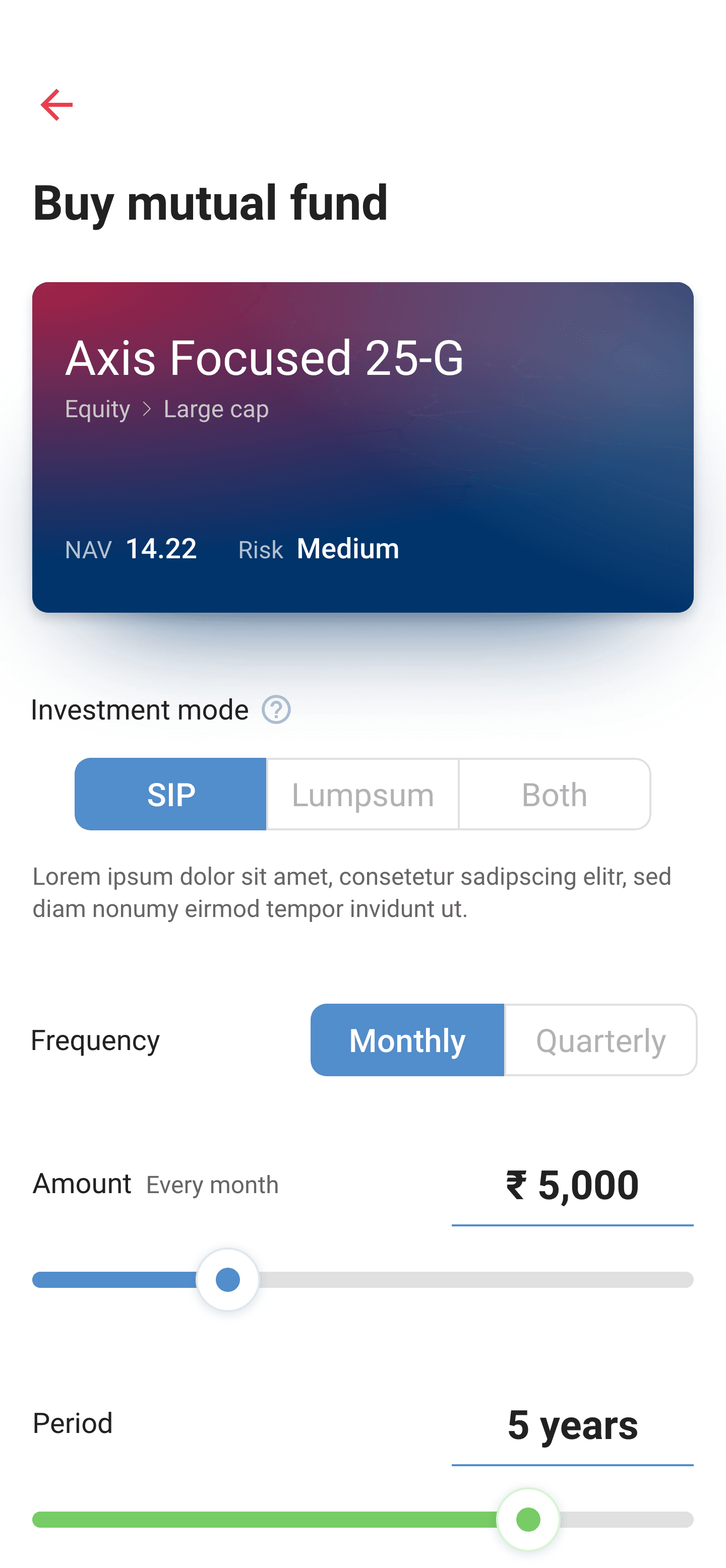
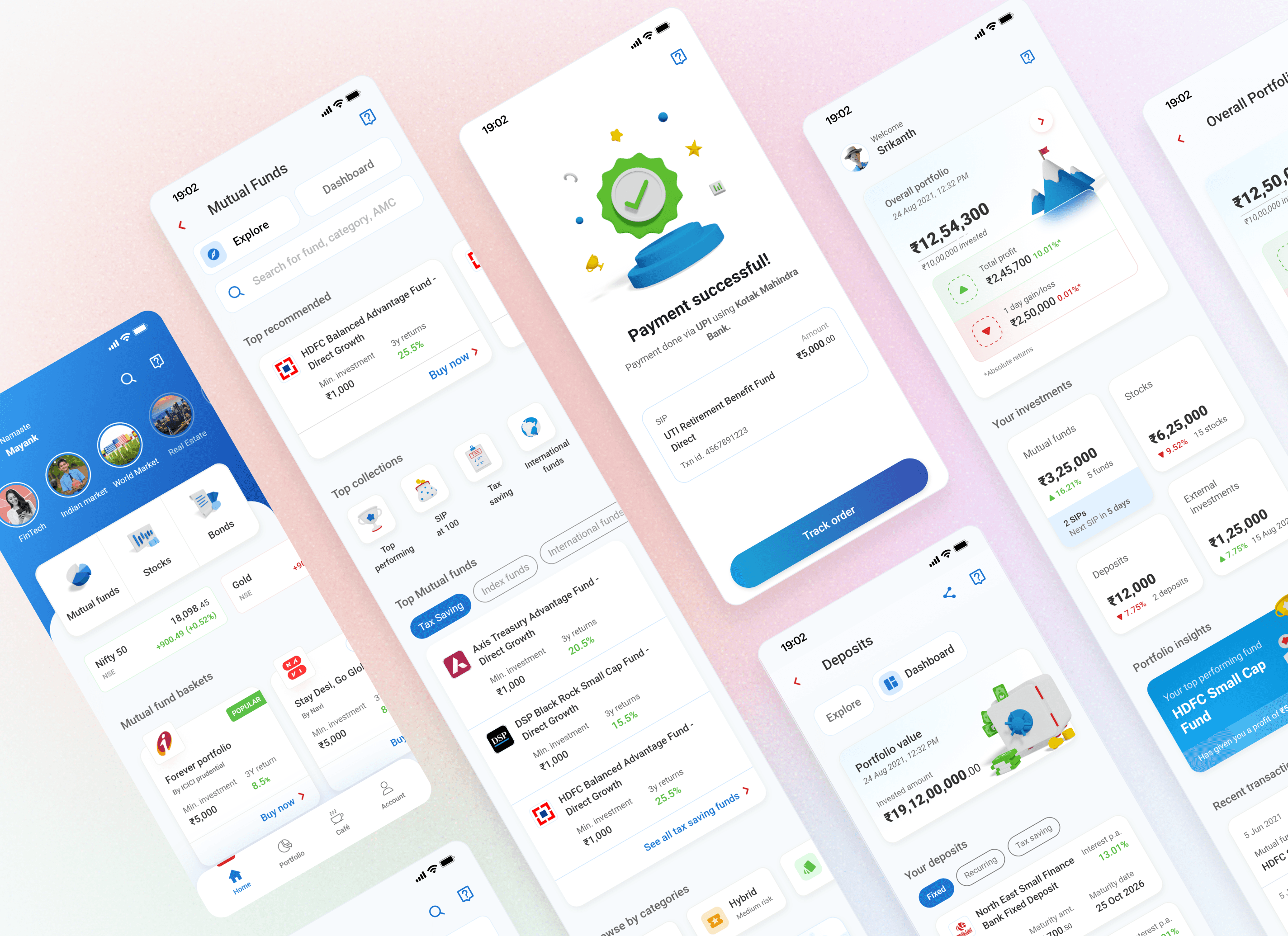
Legacy app screenshots
What We Overcame & Achieved
We faced several significant hurdles, ranging from high user drop-off rates during complex regulatory steps to a general lack of trust in automated financial commitments.
Key Challenges Overcome
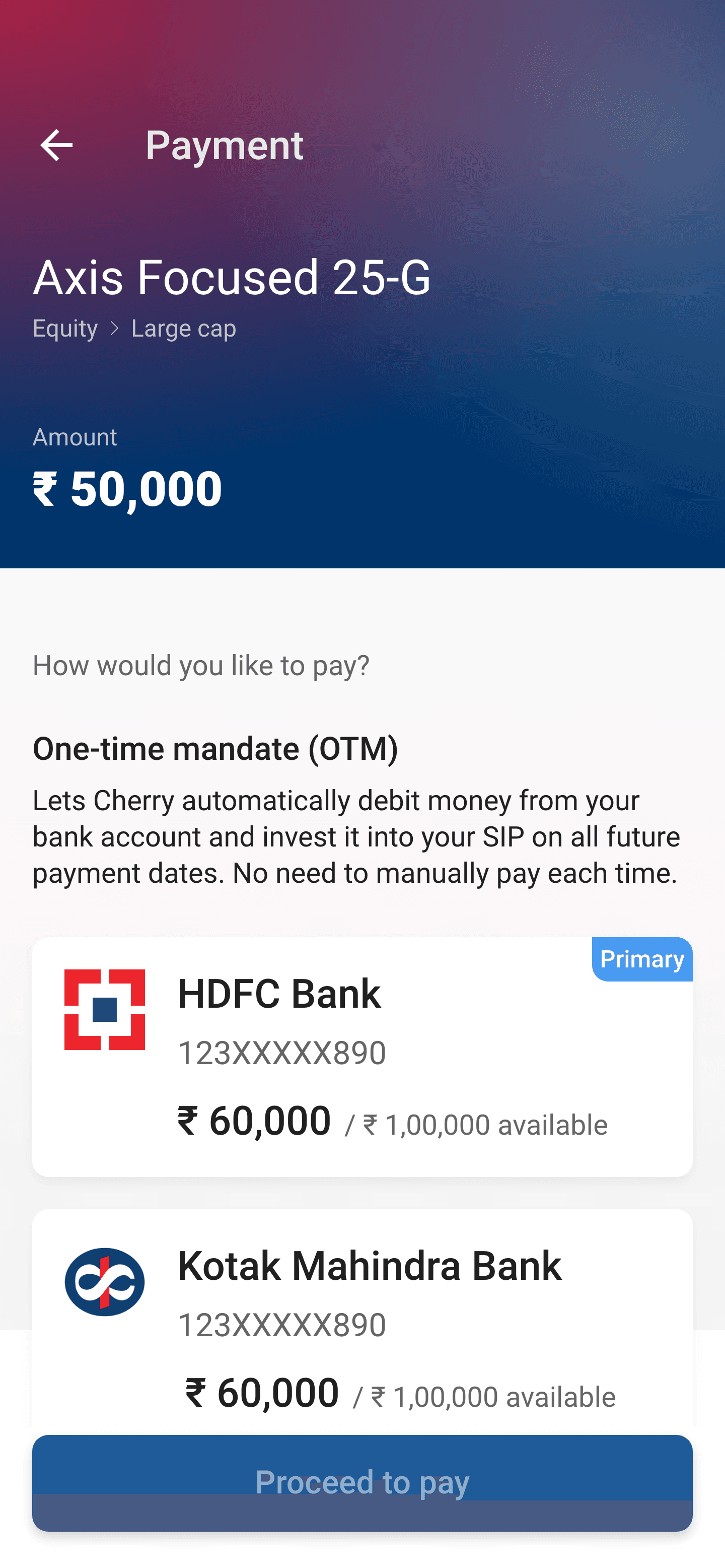
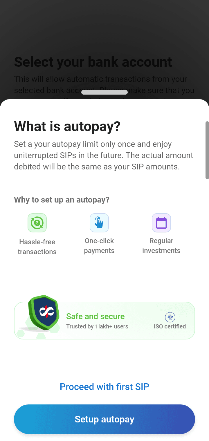
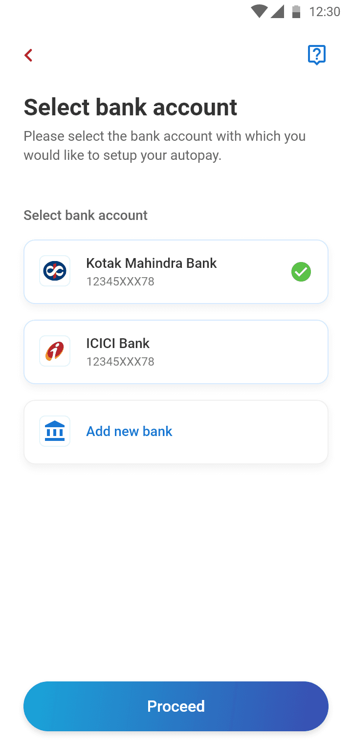
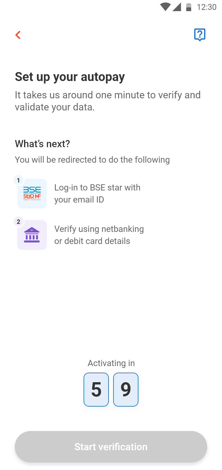
Mandate Friction: Users felt a loss of control when setting up Autopay, leading to a high abandonment rate at the final stage of SIP activation.
Information Overload: The legacy dashboard was cluttered with fragmented navigation and asset classes that were difficult to distinguish.
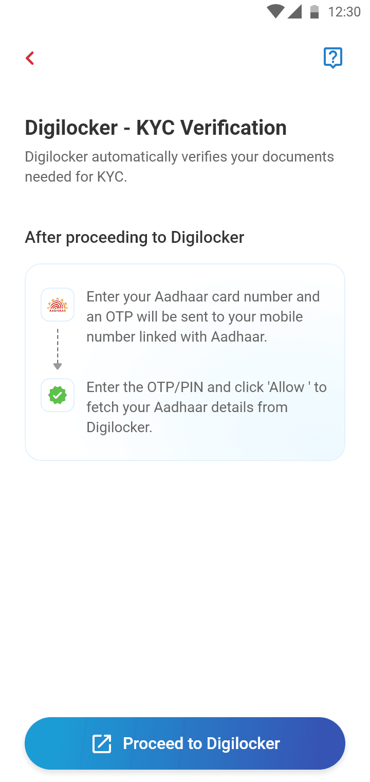
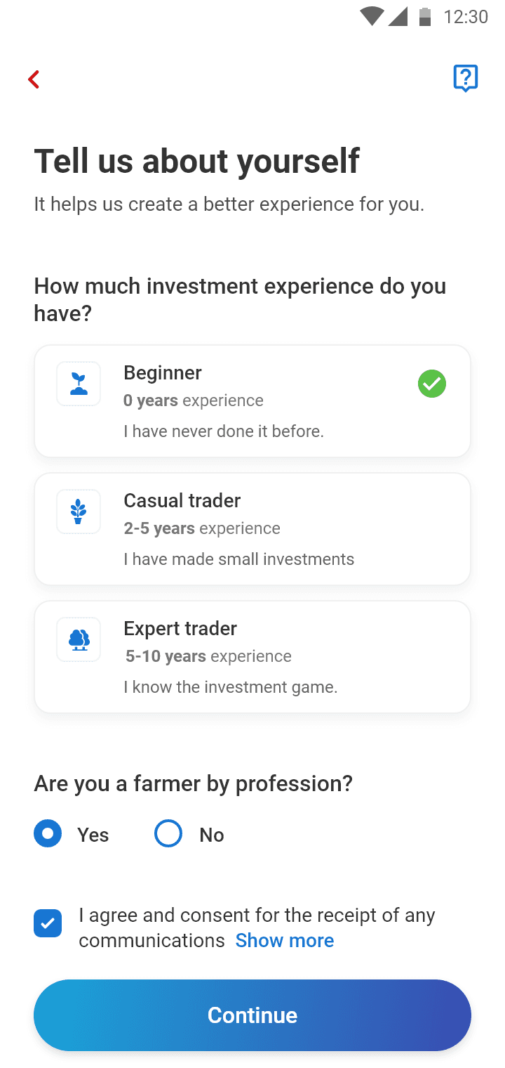
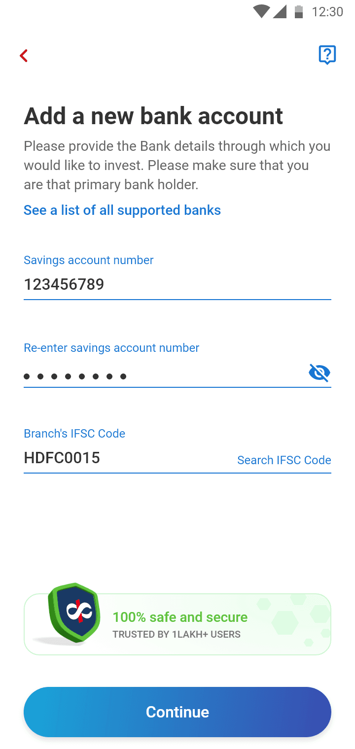
Regulatory Complexity: Onboarding required mandatory KYC, risk profiling, and suitability mapping, which users found tedious and intrusive.
Measurable Results
The redesign transformed the platform’s performance metrics and user sentiment:
Completion Rate: Increased from 62% to 88% for the SIP flow.
Efficiency: Average completion time dropped from 6.5 minutes to 4 minutes.
User Trust: The trust rating improved from 3.1/5 to 4.3/5.
Business Impact: Achieved a significant increase in SIP activation rates and recurring AUM inflow.
Metric
Before
After
Completion Rate
62%
88%
Avg Completion Time
6.5 min
4 min
Trust Rating
3.1/5
4.3/5
The Why and How
Our strategy was rooted in the behavioral insight that in fintech, speed alone does not drive adoption because perceived control does.
Strategic Pillars
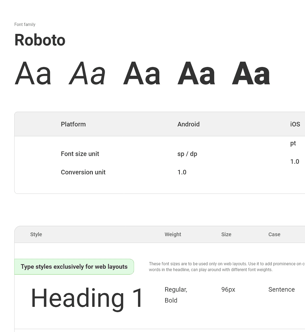
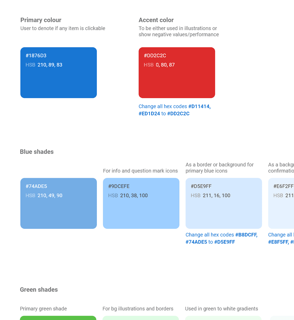
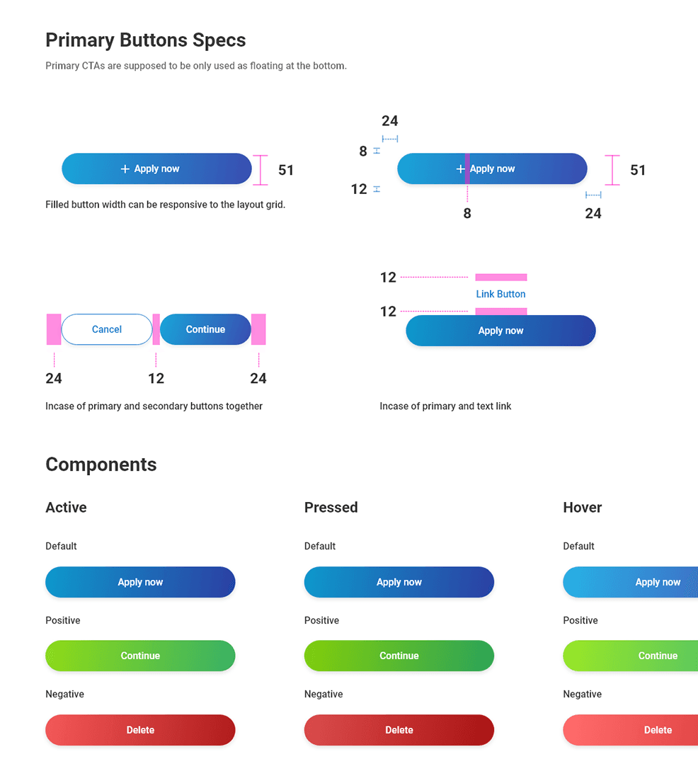
Trust as a Visual Language: We moved away from the outdated aesthetic toward a clean system of gradients and structured hierarchy. We ensured WCAG compliance and used purposeful micro-interactions to provide a sense of calm and reliability.
Behavioral Confidence: Research showed that users often drop off because they fear losing control over their money. We reframed the "Autopay" experience by visualizing future deduction dates and making "Pause/Modify anytime" options explicit.
Intent-Based Sequencing: We restructured the regulatory requirements. Instead of forcing users through KYC immediately, we allowed them to browse and build "investment intent" first. This reduced the perceived effort of the compliance steps.
Our Process
Discovery: I conducted competitive teardowns of Groww, INDmoney, and Kuvera. We identified a gap: while competitors optimized for transactional speed, none truly optimized for the psychological reassurance needed for recurring commitments.

Ecosystem-driven but comparatively complex navigation and mandate steps.

Optimized for speed. Minimal friction during fund discovery and SIP setup. Limited reassurance layers.

Strong data presentation and portfolio visibility. More information-heavy flows.

Advisory-oriented but dense information architecture.
User Research & Testing: To ground the redesign in real behaviour rather than assumptions, I ran moderated usability sessions with 8 participants, recruited directly from Kotak Mahindra Bank’s existing customer base. They were real investors rather than generic testers, and each was given one free Kotak Mahindra Bank stock share within the platform as an incentive. Sessions were conducted remotely over Microsoft Teams, with participants working through an interactive Figma prototype.
Participants were given realistic tasks, most importantly setting up a SIP with an Autopay mandate, and were asked to think aloud as they moved through the flow.
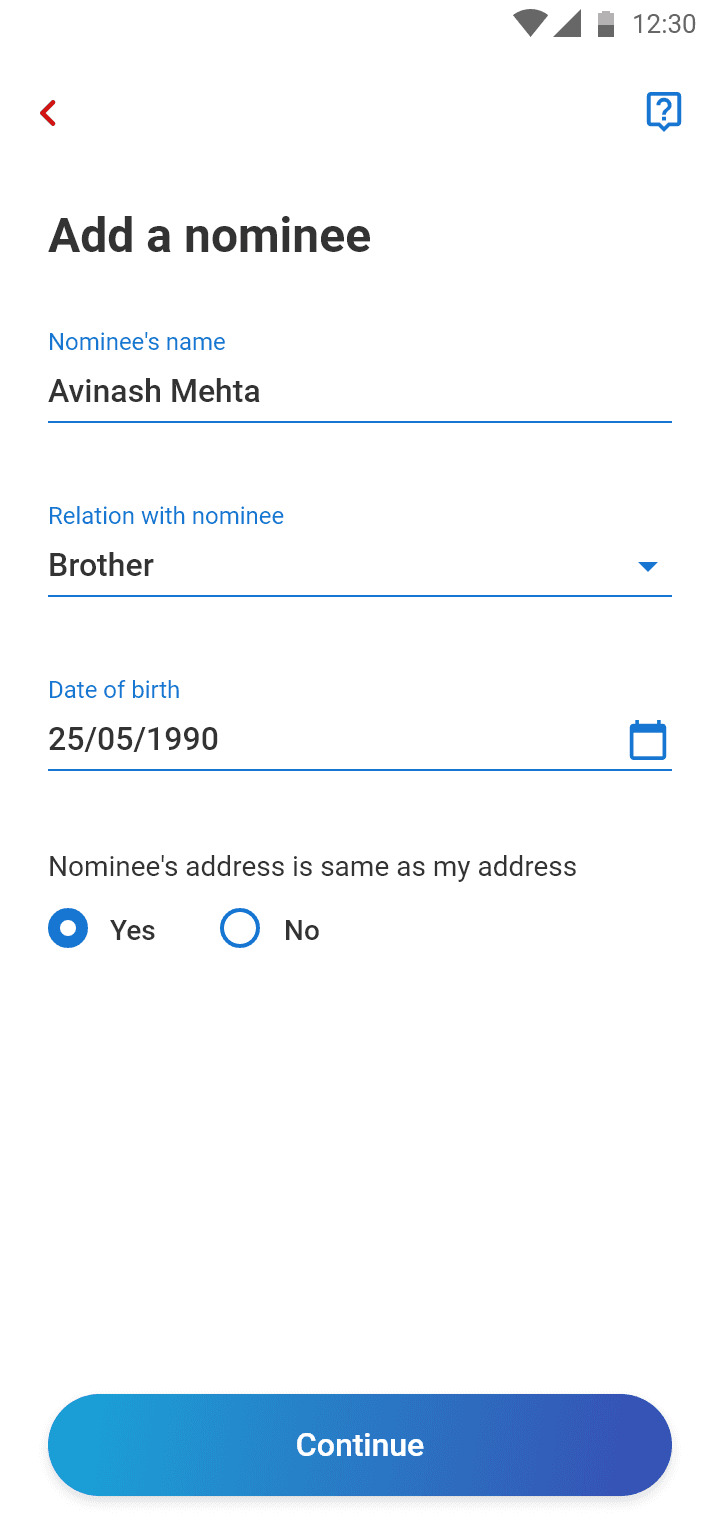
The clearest finding came from the Autopay step. 5 of the 8 participants hesitated to set up Autopay. When probed, the hesitation traced back to two things:A fear of losing control because the recurring, automated nature of the mandate made people anxious. The questions that surfaced repeatedly were “Can I pause it anytime?” and “When exactly will the money go?”
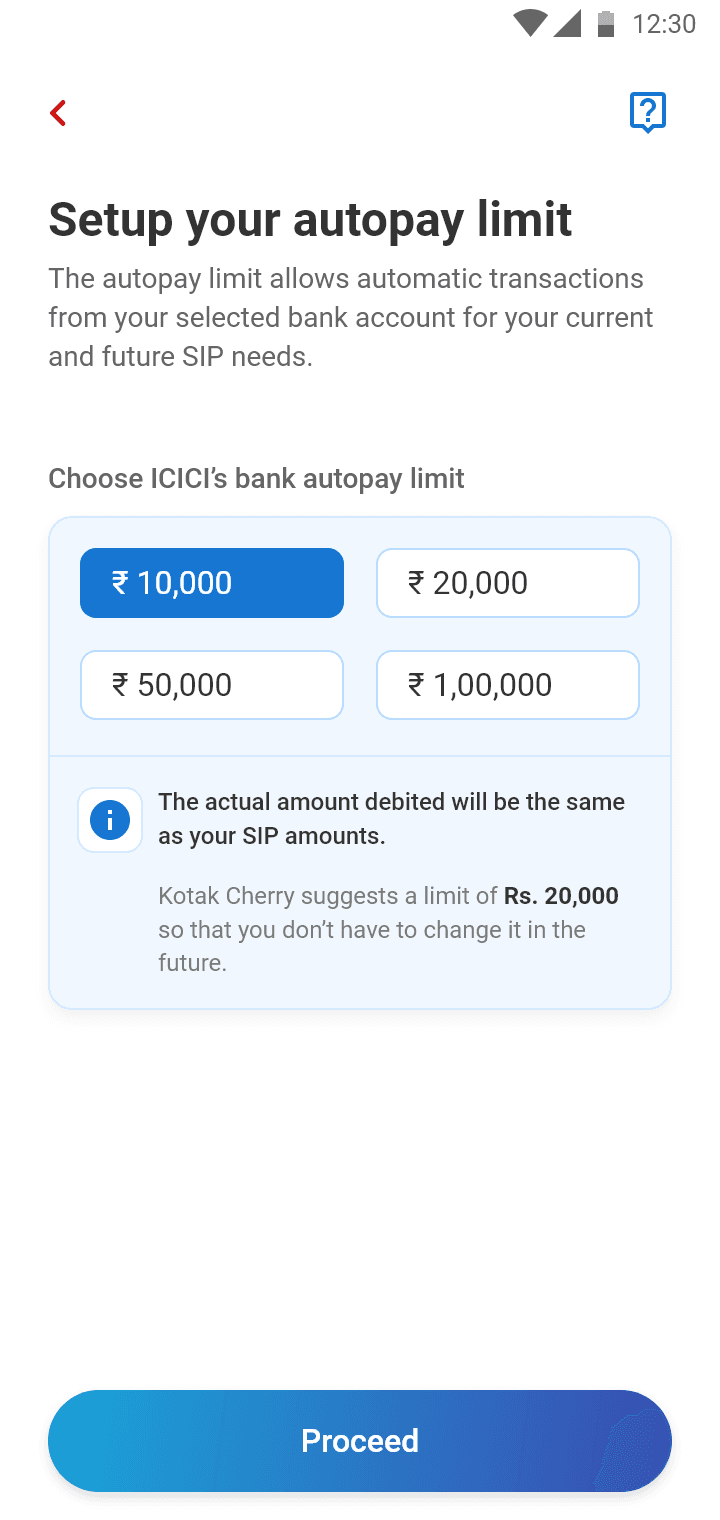
A specific point of confusion around the maximum transaction limit. Autopay requires users to set a highest allowable transaction amount, but participants misread this as the amount they would actually be charged. Several believed setting a high limit meant the app would deduct that full amount.
Prototyping & Testing: We moved from paper wireframes to digital prototypes, testing specific "exit rebuttal" layers to intercept users about to abandon the mandate flow.
Iteration: Based on usability findings, we replaced tabbed navigation with contextual cards on the dashboard. This brought asset returns "above the fold" and simplified the data hierarchy for immediate clarity.
Through this process, we successfully repositioned Kotak Cherry as a modern, trustworthy platform that balances compliance with a seamless, confidence-building user experience.
Deep Dive: Solving Autopay Hesitation
The single biggest drop-off point in SIP activation was the Autopay mandate, which is the step where customers authorise recurring automatic deductions. It was also the clearest example of how research reshaped the design, so it’s worth walking through on its own.
The Research
To ground the redesign in real behaviour rather than assumptions, I ran moderated usability sessions with 8 participants, recruited directly from Kotak Mahindra Bank’s existing customer base. They were real investors rather than generic testers, and each was given one free Kotak Mahindra Bank stock share within the platform as an incentive. Sessions were conducted remotely over Microsoft Teams, with participants working through an interactive Figma prototype.
Participants were given realistic tasks, most importantly setting up a SIP with an Autopay mandate, and were asked to think aloud as they moved through the flow.
What We Found
5 of the 8 participants hesitated to set up Autopay. When probed, the hesitation traced back to two distinct problems:
Fear of losing control. The recurring, automated nature of the mandate made people anxious. The questions that surfaced repeatedly were “Can I pause it anytime?” and “When exactly will the money go?”
Confusion about the maximum limit. Autopay requires users to set a highest allowable transaction amount. Participants misread this as the amount they would actually be charged, and several believed setting a high limit meant the app would deduct that full sum.
What We Changed
Each finding mapped to a specific design response.
The limit confusion was a framing problem, not a user error.

Preset limit options replace open entry, a clear callout confirms the limit is an authorisation ceiling rather than the amount charged, and a suggested limit guides users who are unsure.
The control anxiety needed the whole ongoing experience to feel reversible.

A dedicated management view separating Active, Paused, and Inactive SIPs, making the state of every commitment visible at a glance.


The Takeaway
The Autopay step wasn’t failing because it was slow or badly built; it was failing because it asked people to hand over control without showing them how to take it back. Fixing it wasn’t about adding features; it was about making the system’s reversibility and honesty visible at the exact moment hesitation peaked.
Designing high-trust products that balance compliance, clarity and conversion.
Schedule a call with Abhijeet