Evolve by Money Mart
Redesigning a Risk-Aware POS System for In-Store Lending

Overview
When a customer walks into a Money Mart store to apply for a loan, a staff member called a Financial Service Representative (FSR) sits with them and fills out an application on a tablet-based system called Evolve.
The process takes about 20 minutes.
The problem was that nobody knew whether the customer would actually be approved until the very end — after everything was filled out, after all documents were scanned, after all that time was spent. Only then would the system check the customer's credit.
If they got rejected, two things happened. The customer left empty-handed and with a mark on their credit score — something that makes it harder to borrow money in the future. And the staff member had just spent 20 minutes on an application that was never going to work.
This was already a problem. Then government regulations tightened, and rejection rates started climbing. It became urgent.
I was the lead designer brought in to rethink how the system worked — not to make it look better, but to make it work better for both the staff using it and the customers sitting across the counter.
What We Overcame and Achieved
The core problem sounds simple: find out sooner whether someone qualifies. But getting there required rethinking how the entire application was structured, and convincing the business that the status quo was costing more than a fix would.
Here's what changed, and what it produced:
We added an early eligibility check before any credit impact.
We introduced a feature called Quick Apply — a lightweight check at the start of the process that estimates whether a customer is likely to qualify, without touching their credit score. If it looks like they won't qualify, the staff member can have an honest conversation early, before anyone's time is wasted or credit is affected. This shifted the entire process from "fill everything out and hope for the best" to "know before you commit."

Dashboard with Quick Apply Eligibility Results tiles
We fixed a blind spot in how income was captured.
When we tested Quick Apply with real staff in stores, we noticed a recurring issue: the form only had one field for income, but many customers have more than one source — a part-time job, government benefits, a second gig. That meant the eligibility estimate was often wrong. We updated the form to support multiple income sources, which made the estimates far more accurate. This led to an 8–12% improvement in loan approval rates for short-term loans, and eligible customers were approved for 10–15% higher amounts on average.

After User Testing

After User Testing
We used AI to make sense of user research faster.
Across more than 10 testing sessions with staff, I fed the transcripts into an AI tool to identify patterns. It surfaced themes we might have missed and helped us move faster from research to action.
We showed staff all options at once, instead of one at a time.
Previously, staff had to start a separate application flow for each product — installment loan, payday loan, credit card. Now, after a single eligibility check, a summary screen shows everything the customer qualifies for at once. Staff can then guide the customer to the right product without restarting the process or running additional credit checks. This reduced unnecessary back-and-forth between staff and customers by around 20%.
We made it easier for customers to come back.
If a customer didn't complete their application that day, their eligibility results were saved for up to 7 days. When they came back, staff could pick up the conversation right where it left off — no new credit check needed.

Dashboard with Quick Apply Results tiles
We removed a frustrating step in the signing process.
Every time a customer needed to sign a document on a separate tablet, they had to enter a 6-digit code to authenticate. This was painful — especially for elderly customers — and caused repeated delays. We changed the system so the main computer and the tablet stay connected throughout the session. No more codes. No more interruptions.
We automated income verification.
Staff used to type in income figures by hand and scan physical documents. We connected the system to a service called Flinks that lets customers securely share their bank data directly. This reduced manual errors and made the income verification process faster and more reliable.
We standardised how staff report large cash transactions.
Money Mart is legally required to file a report any time a customer conducts cash transactions totalling over $10,000 in a 24-hour period — a federal anti-money laundering requirement. Before this work, that reporting process was fragmented and inconsistent across stores, which created compliance risk and added extra manual work for staff. We designed a standardised form within Evolve that captured all the required information in one place, reduced the number of manual steps, and made it easier for FSRs to complete the report accurately without needing to piece things together from multiple sources.
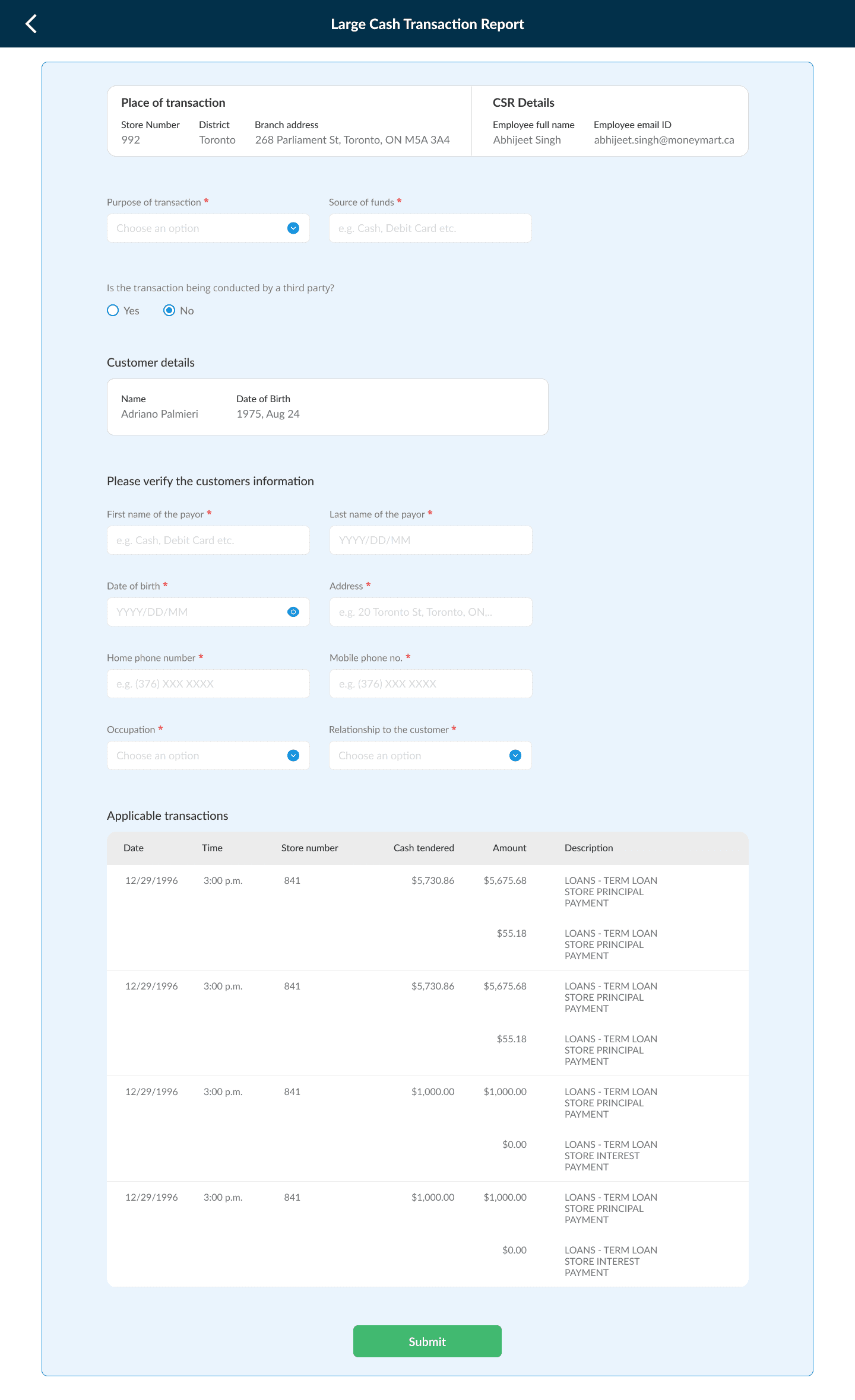
Large Cash Transaction Report if the Customer themselves making the payment
The Why And How
The real cost of the old system wasn't obvious at first.
A rejected application feels like a customer service problem. But it's also a compliance problem, an operational problem, and — most importantly — a financial harm problem for the customer. Framing it that way is what got stakeholder buy-in. Every unnecessary credit check that led to a rejection was costing the business in staff time, store performance metrics, and customer trust. The fix wasn't expensive relative to what the problem was costing.
We tested with real staff throughout, not just at the end.
Rather than designing in isolation and handing things off, we built a small group of FSRs who reviewed the work regularly. We'd bring two different versions of a feature, watch them work through realistic scenarios, and ask them to explain what felt confusing. The multi-income update, the eligibility dashboard tiles, and the product summary screen all came directly from those
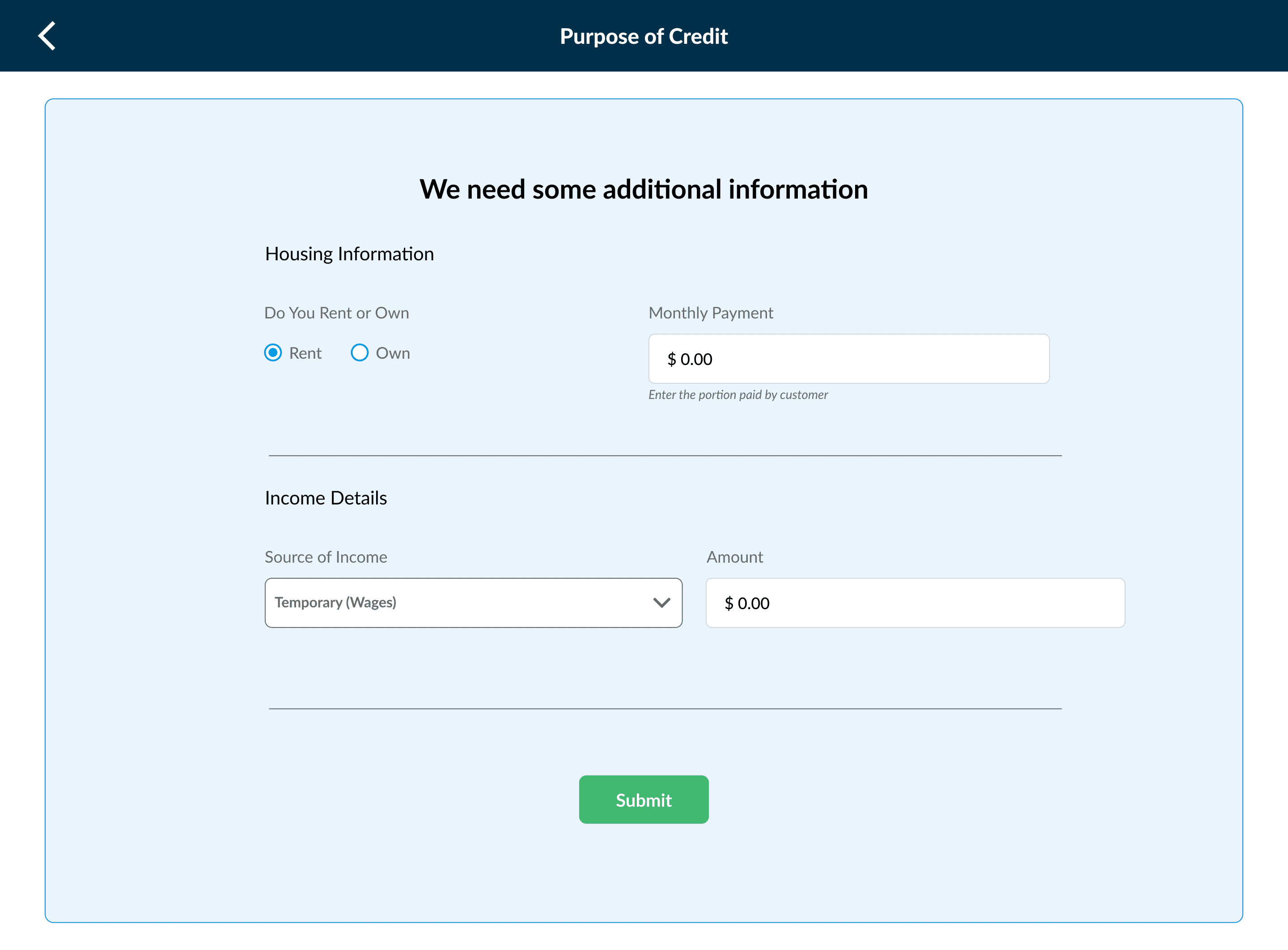
We killed a feature when it stopped making sense.
Early on, we added a step that asked customers what they planned to use the loan for. The idea was to gather data for the business. What we saw in stores was different — customers felt like they were being judged, and staff were quietly skipping the step anyway. We removed it. In a setting where someone is asking for financial help, trust matters more than data collection.
Not every idea is worth keeping.
The goal was never to add features. It was to build a system that reduced harm, gave staff clarity, and held up under regulatory pressure. Sometimes that meant saying no, or undoing something that had already been built.
The result was a system that could handle a more complex, regulated environment — one that protected customers from avoidable financial damage, and gave the staff using it every day the tools to do their jobs with confidence.
Designing high-trust products that balance compliance, clarity and conversion.
Schedule a call with Abhijeet