ONDC by Kotak
Building a Grocery Marketplace Where No One's Really in Charge
How we designed a trustworthy shopping experience on top of infrastructure that gives the platform almost no control.

Overview
In India, most people buy groceries online through apps like BigBasket or Blinkit. Those platforms control everything — the prices, the stock, the delivery, the refunds. If something goes wrong, you know who to call.
The Indian government launched something called ONDC (Open Network for Digital Commerce) to change that. The idea was to let any local grocery store sell digitally, without being dependent on large platforms. Think of it like how email works — you can send a message from Gmail to Yahoo, because they share a common standard. ONDC works similarly for commerce.
Kotak wanted to build a grocery shopping app on top of this network. The opportunity was real — smaller stores could finally compete digitally, and customers could support local retailers while shopping from their phones.
But there was a fundamental design problem: unlike traditional grocery apps, this platform couldn't control prices, couldn't guarantee delivery times, couldn't manage inventory, and couldn't promise consistent refund policies. Every store handled those things differently.
My job was to figure out how to make that feel trustworthy and easy to use for everyday shoppers — people who were already used to the polished, predictable experience of centralised apps.
What We Overcame and Achieved
The core challenge wasn't building a grocery app. It was building one where almost everything that makes grocery apps feel reliable — consistent pricing, predictable delivery, centralized accountability — was outside our control.
Here's what we ran into, and how we solved it:
People expected the platform to be responsible for everything.
When we tested early versions with users, they assumed that if something went wrong — a wrong price, a late delivery, a missing item — the app would sort it out. That's how BigBasket and Blinkit work. But on ONDC, each store sets its own prices and manages its own stock. We couldn't promise the same guarantees.


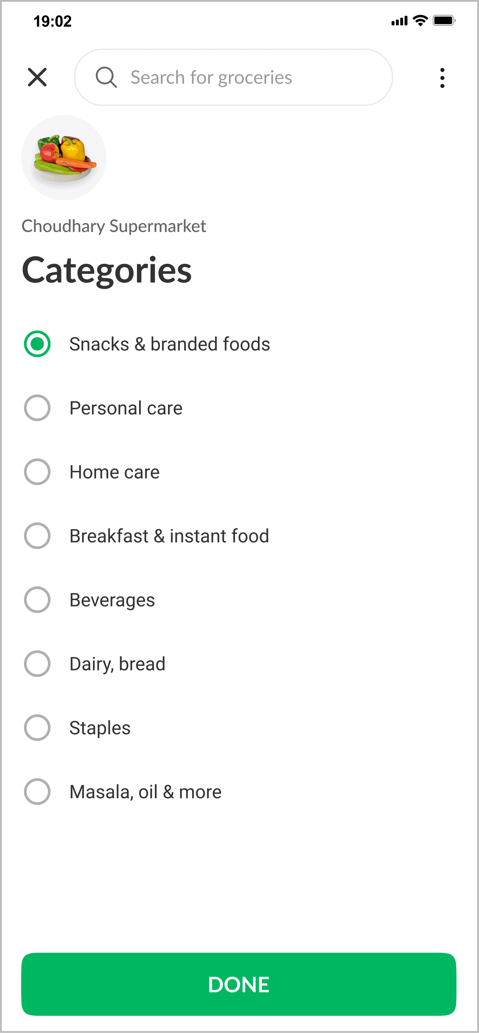
Rather than hiding this complexity, we made it visible and legible. Every product listing showed which store it was coming from, along with that store's ratings and delivery time. The cart grouped items by store, so it was always clear you were buying from multiple independent retailers, not a single platform. This reframed the relationship — users understood they were buying from a store, with the app acting as the connection point.
Delivery was unpredictable by design.
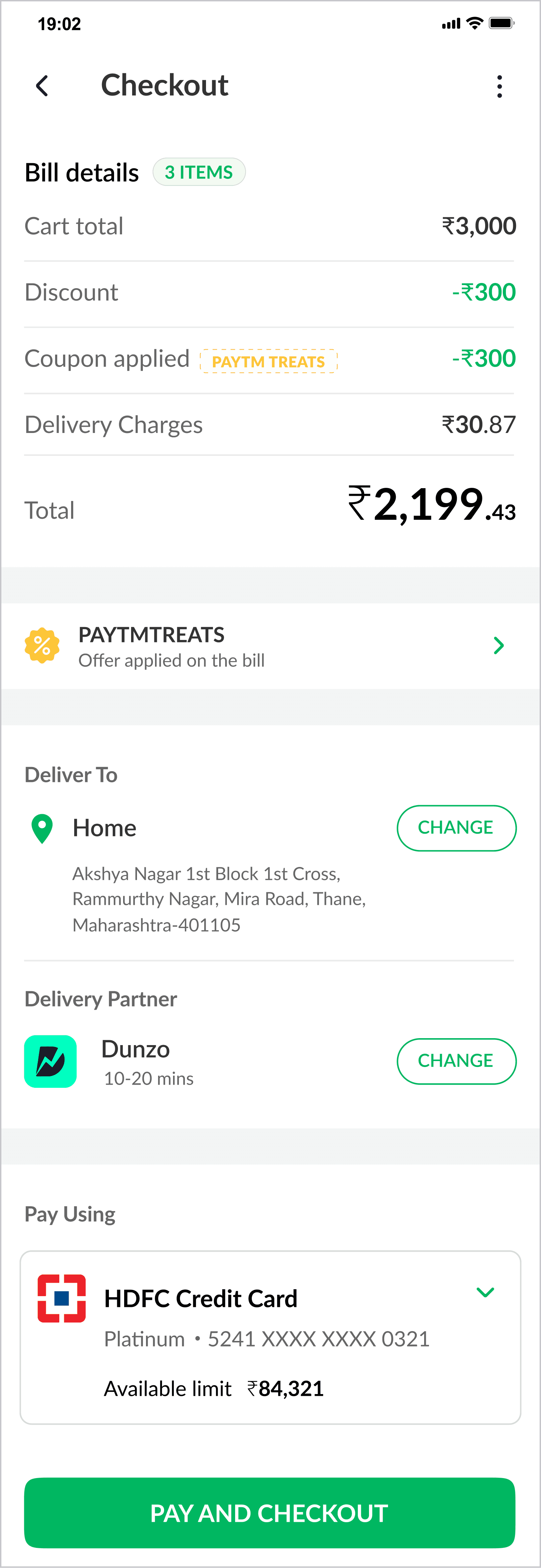
Some stores handle their own deliveries. Others use third-party services like Dunzo or LoadShare. We made this a visible choice for the customer — showing estimated delivery times, ratings, and costs for each option — rather than silently assigning a delivery partner in the background. When users could see who was delivering and what it would cost, they felt more in control. And if something went wrong, there was no confusion about who was responsible.

Customers built carts across multiple sessions before checking out.
Testing revealed that grocery shoppers don't always complete a purchase in one go — they add items over time and come back later. We made sure carts persisted between sessions, with clear per-store subtotals so nothing felt confusing when they returned.
Out-of-stock items were causing frustration when hidden.
The original approach removed unavailable product variants from view. Users found this disorienting — they'd search for something, not find it, and assume it didn't exist rather than realising it was temporarily out of stock. We changed this so unavailable options remained visible but clearly marked, which reduced confusion and set more honest expectations.

Checkout needed to be completely transparent.
Because pricing was set by individual stores — not the platform — we built a detailed breakdown into every checkout screen: item total, any discounts, coupon savings, delivery charges, and final amount. In a system where prices can vary store to store, transparency at the moment of payment isn't a nice-to-have. It's what prevents distrust.
The result was a fully functional multi-store grocery marketplace — the first of its kind built on ONDC by Kotak — that successfully handled orders across multiple stores, multiple delivery models, and a wide range of store-controlled pricing, without leaving users feeling confused or exposed.
The Why and How
The real design problem was trust, not features.
We looked at other apps already operating on the ONDC network before we designed anything. They all had the same infrastructure. What they lacked wasn't functionality — it was clarity. Users coming from centralized grocery apps had expectations the network simply couldn't meet by default. Our job wasn't to pretend otherwise. It was to make the decentralized nature of the system understandable, so users could make informed decisions and know where to direct questions if something went wrong.
We studied what users actually cared about.
Research showed that 38% of grocery shoppers prioritised saving time above everything else, and 30% wanted to place large, consolidated orders in one go. Both of those needs were harder to meet in a decentralised system — buying from multiple stores adds complexity, and delivery times vary. Knowing this upfront meant we could design specifically to reduce that friction, rather than assuming what users needed.
We tested comprehension, not just usability.
Standard usability testing asks whether people can complete tasks. We went a step further — we specifically tested whether users understood the system. Did they know they were buying from multiple independent stores? Did they understand who was responsible for delivery? Did they grasp why prices differed for the same product? The answers shaped structural decisions, not just visual ones. Things like how many times to show the store name, how prominently to display delivery partner information, and how to order the checkout breakdown all came from watching real users navigate genuine confusion.
Users initially assumed platform-level accountability.
→
Reinforced store identity at listing, cart, and checkout.
Users preferred to see the cheapest delivery option first, then the fastest.
→
Reordered delivery partner presentation accordingly.
Users compared prices across stores when searching for specific products.
→
Increased prominence of store metadata in listings.
Users built carts over multiple sessions before completing checkout.
→
Ensured cart persistence and clear subtotal grouping per store.
Hiding out-of-stock variants caused frustration.
→
Displayed unavailable variants visibly instead of removing them.
Repetition was intentional, not an oversight.
The store name appeared at the listing, in the cart, and again at checkout. The delivery partner was shown during selection and confirmed again before payment. To a designer, that might look redundant. But in testing, every time we removed one of those repetitions, users lost track of who they were buying from. In a system without centralised accountability, reminding people of the relevant details at every step wasn't over-engineering — it was the experience holding everything together.
Designing high-trust products that balance compliance, clarity and conversion.
Schedule a call with Abhijeet